Jess B4 West- Stagette Invites


With 1 month until her wedding, and 5 years after our last wine trip to the Okanagan, a group of friends headed out for a stagette for our friend Jessica who was about to marry, well, West. Pulling a spin on their wedding hashtag, #westandjess2017 I came up with the concept for an invite suite based on her love of purple and girly things.
check #jessb4west for more photos from the trip

Confession: I am not a bridesmaid, nor were any of us on the trip part of the actual wedding party (one of us is going to be the MC- + it's not me), so I kind of had to make a best guess at what she would like. When I design things like this my goal is to make something that I'm proud of but may not ever want for myself- I want the person I'm designing for to be happy. It's a super challenge to find your own voice while at the same time trying to suffocate it, but at the end it's like even more proud making because it was out of the comfort zone.

What I mean by this is that my least favourite colour in the world is purple.
I also mean I do not like girly things for myself. I like clean lines // graphic // mess.
Ummm, yeah this is about as purple and girly as you can go.
but i needed to get the hell over myself because that's what the bride-to-be loves.
And I figure there's so few chances in life for people to just do really nice things for you that you love, why not give it to her?
I hope she liked it.
And even though it's purple and girly, I'm still very, very proud of it. And actually, I think it's really lovely. Ok. I like it. I like this purple girly thing I created, OK?


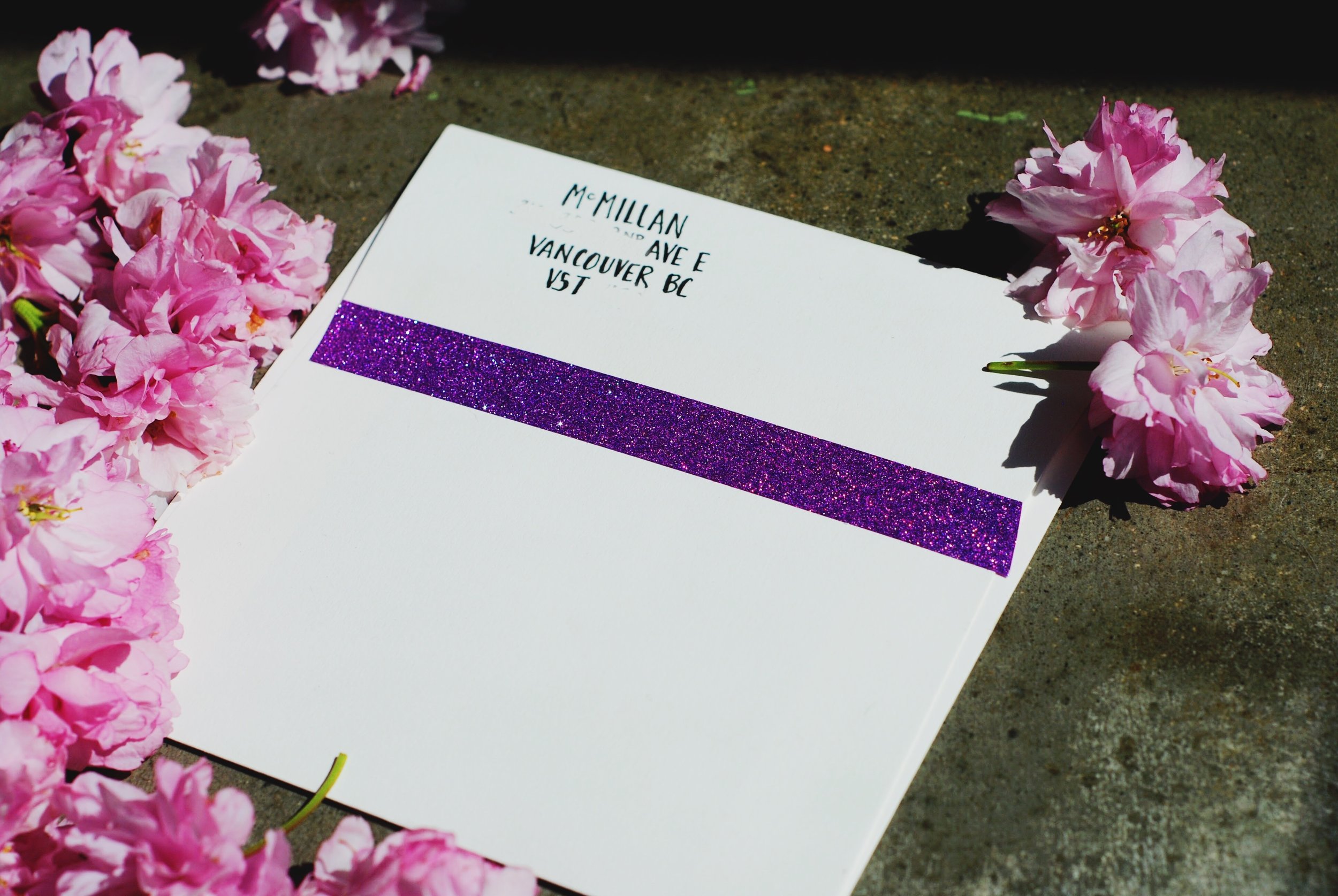
I decided to go with a 5x5 because I still have stacks and stacks of archival paper envelopes from Artifact Uprising that fit 5x5 and they are awfully beautiful to write on. I learned how to do crazy fancy, so in style, very wedding-ing // mad girly script font because that seems to be what the bride likes. It was not easy. I wrote each name several times, erasing and re-drawing until I got it right, then traced it very lightly with pencil onto the envelope and coloured it in with my purple micron pens. It took like 5 days.
its not a natural talent ok
but now I'm like oh yeah look at me and what I can do, like NBD, can't you?

My sister and I went to Michaels together which is def. something we should never do, cause who has that type of money? We're very enabling. Yes, you need those feathers. Yes, I need those sparkling stickers. Yes, we both need a new pen set.
But we went looking for purple paper with a bold design so I could put something in the corner of the invite (I can't draw OK?) I happily found a stack of boho print with tons of purple options on sale and snapped it up (looks like they're not selling it anymore, but a similar pad here). Once home I took photos of several of the paper designs and put them into photoshop and tried them out on the invite before settling on the paisley print.
I also wrote and scanned in the lettering and resized and move it around in Illustrator until I came up with a design that made me happy.
I cut out envelope liners with different papers from the pack so there are 4 different designs, as each sheet fit 2 liners and I was sending 8 invites.

Kyle sent out the invites to be printed at Staples but when we picked them up they were crazy flimsy and I was super upset. I decided that even though I was over making them at this point [it just became one of those projects that. never. ends.] that I did not put in all that work to send a flimsy invite, and so I took the paisley print paper (luckily not already cut up into liners) and glued it onto the back of each invite and carefully, carefully cut it out. I really think when sending an invite it should have some heft in your hand, because pulling out a heavy invite makes all the difference in the world. Like actually.


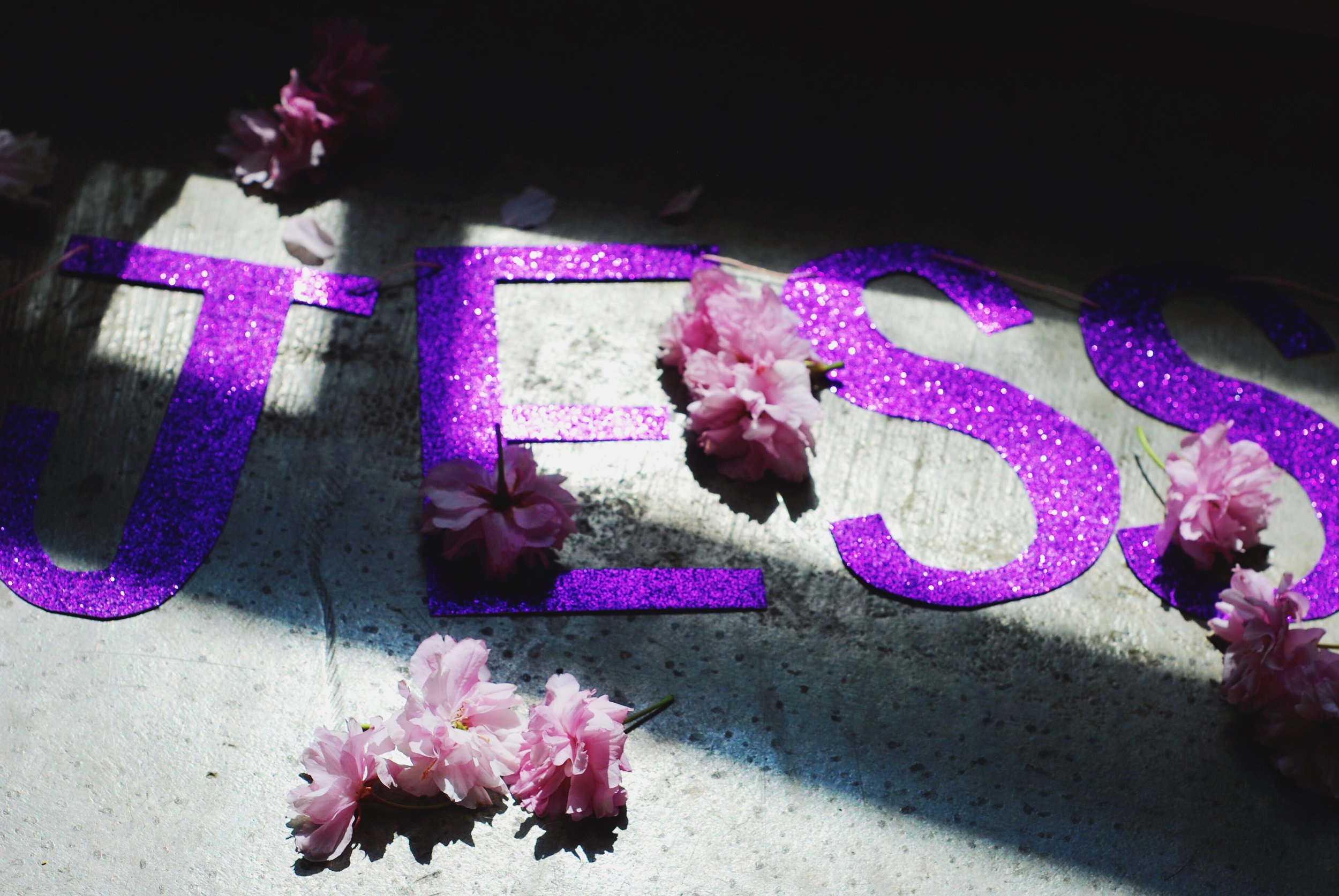
I then cut out a banner of Sparkling Letters (I swear I'll do a DIY post one day) in the same font as the writing on the cards, which I am sort of of the opinion doesn't look as nice in banner-sized as invite-sized but by this point- literally nobody cares.


For return addresses I just did the simple font and didn't add a purple swirly Eva because I wasn't the hostess, just the invite creator, and then sealed them up with purple sparkle washi tape that magically matched the banner like whoa.
The invites read:
Get ready to celebrate Jessica at her last fling before the ring.
A decadent wine-soaked weekend at Sparkling Hills Resort and Spa.


hey Jess,
we love you
+ now that the b4 part is partied out
we're so excited to celebrate jess + West.


We went to Japan and I bought stickers and I used them. I never use stickers. But because I’m always trying to save them for something special.
It was time to get back into creating and keeping track of our trip in this little notebook woke up a piece of me that wanted to create. And the desire to create is so much stronger than the desire to be perfect. Here’s my perfectly imperfect bullet journal.